Metadata
- Date :: 15-04-2025
- Tags :: web-dev
Notes
🌟 CSS Positioning – Explained Like You’re 5 🌟
(But really smart for your age!)
👋 What is CSS Positioning?
Imagine you’re playing with building blocks on the floor. By default, when you place a block, it just goes next to or below the last one you placed, right?
That’s exactly what happens with HTML elements on a website – unless you use CSS positioning to move them around!
🧱 Four Types of CSS Positioning
There are 4 main types of positioning in CSS. Let’s look at each one using colorful blocks and fun analogies!
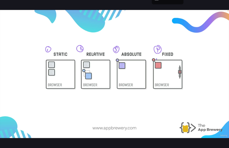
1. 🧊 Static Positioning (The Default)
Think of it like this:
- You place your toys in a line, one after the other.
- That’s how HTML elements behave with static positioning – they just go where they’re told in the order you write them.
Key Points:
- You don’t need to set
position: staticbecause it’s already the default. - You can’t move it using
top,left,right, orbottom. - It’s like a rule-following toy: it doesn’t move even if you ask!
📘 Example:
You have:
<h2>This is a heading</h2>
<code>This is code</code>
<div>This is a green box</div>
All these will appear one after another — stacked like pancakes 🥞!
2. 🧭 Relative Positioning (Move from Where You Are)
Think of it like this:
- You place your toy on the floor.
- Now, you nudge it a little bit to the right or up or down – but you remember where it used to be.
Key Points:
- It moves relative to its original place.
- You can now use
top,left,bottom, orrightto move it around. - Other toys (elements) still remember its original space!
🧠 Remember:
It’s not “relative to another element” – just to itself.
📘 Example:
.my-box {
  position: relative;
  top: 50px;
  left: 50px;
}
That moves the box 50 pixels down and to the right, but other elements still act like it’s in the old spot.
3. 📍 Absolute Positioning (Stick it Anywhere!)
Think of it like this:
- You take your toy and glue it somewhere else on the wall or table.
- Now it’s not on the floor anymore, and it doesn’t follow the line!
Key Points:
- It’s removed from the normal flow – other toys ignore it.
- It moves relative to the nearest positioned ancestor (the box it’s inside that has
position: relative,absolute, orfixed). - If there’s no ancestor with a position, it sticks to the top-left of the entire page.
📘 Example:
.outer {
  position: relative;
}

.inner {
  position: absolute;
  top: 50px;
  left: 50px;
}
Here, .inner moves 50px from the top and left of .outer.
🎯 Tip: Always set the parent element’s position to relative if you want the child to move inside it.
4. 📌 Fixed Positioning (Sticky to the Screen!)
Think of it like this:
- You tape your toy to the screen 😲
- Even if you scroll the page, the toy stays right there!
Key Points:
- Always stays in the same spot on the browser window.
- Doesn’t move with the page content.
- Super useful for things like sticky menus, “back to top” buttons, or pop-ups!
📘 Example:
.fixed-box {
  position: fixed;
  top: 50px;
  left: 50px;
}
The box stays 50px from the top and left, even when you scroll.
✨ Bonus: The Z-Index (Who’s On Top?)
Imagine blocks stacked on top of each other.
z-indextells which one is on top.- Bigger number = comes to the front.
- You can even use negative numbers to push things behind others!
📘 Example:
.box-a {
  position: absolute;
  z-index: 100;
}

.box-b {
  position: absolute;
  z-index: 50;
}
So box-a is on top of box-b.
💡 Tip: z-index only works on elements with position set (like absolute, relative, or fixed).
🎨 Let’s Build a Fun Circle Inside a Rectangle!
Here’s your final mission:
Make a red circle sit right in the middle of a blue rectangle — but only using position, not margins!
🔷 Step 1: Create the Blue Rectangle
<div class="blue-box">
  <div class="red-circle"></div>
</div>
.blue-box {
width: 500px;
height: 300px;
background-color: blue;
position: relative;
top: 200px;
left: 200px;
}🔴 Step 2: Create the Red Circle
.red-circle {
  width: 200px;
  height: 200px;
  background-color: red;
  border-radius: 50%;
  position: absolute;
  top: 50%;
  left: 50%;
}
Wait! That doesn’t perfectly center the circle because it’s starting the corner of the box in the center. You’d need to shift it back using transform.
🎯 Perfect Center Fix:
.red-circle {
  width: 200px;
  height: 200px;
  background-color: red;
  border-radius: 50%;
  position: absolute;
  top: 50%;
  left: 50%;
  transform: translate(-50%, -50%);
}
Now the center of the circle sits in the center of the rectangle! 🎉
🧠 Final Thoughts – Remember This!
| Type | Moves? | Relative To? | Part of Normal Flow? | Can Use Z-Index? |
|---|---|---|---|---|
| Static | ❌ No | Nothing – follows HTML order | ✅ Yes | ❌ No |
| Relative | ✅ Yes | Itself (original position) | ✅ Yes | ✅ Yes |
| Absolute | ✅ Yes | Closest ancestor with position set | ❌ No | ✅ Yes |
| Fixed | ✅ Yes | Browser window (not page!) | ❌ No | ✅ Yes |
🎮 Practice Time!
Now go play with some HTML and CSS. Try moving things around. Break stuff. Fix it. Experiment. That’s how all great web wizards learn! 🧙♂️💻
If something goes “oops,” just ask yourself:
- What is the position?
- What is it relative to?
- Is it supposed to be in the normal flow?
- Is it supposed to move when I scroll?